Preliminary Sketches - January 29th, 2018:
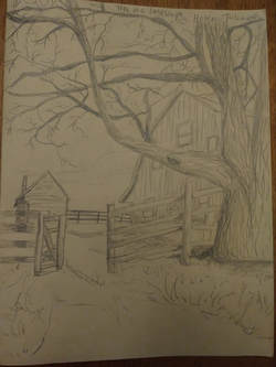
Tree in a Landscape:
This is a sketch I did of a barn and tree that is near Montpelier in Virginia. I based this sketch off of a picture that I took from my family's car as we drove past. The most difficult part for me was drawing the details of the bark on the tree. I also found all the little branches to be challenging, because they took a lot of patience.
This is a sketch I did of a barn and tree that is near Montpelier in Virginia. I based this sketch off of a picture that I took from my family's car as we drove past. The most difficult part for me was drawing the details of the bark on the tree. I also found all the little branches to be challenging, because they took a lot of patience.
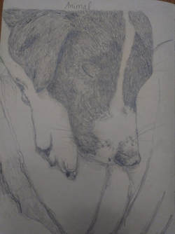
Animal:
This is a sketch I did of my dog, Gordo. I based this sketch off of a picture that I took while he was sleeping on the couch in the living room. The most difficult part for me was sketching all of his individual fur hairs while also making sure I added some value to them (especially the black hairs).
This is a sketch I did of my dog, Gordo. I based this sketch off of a picture that I took while he was sleeping on the couch in the living room. The most difficult part for me was sketching all of his individual fur hairs while also making sure I added some value to them (especially the black hairs).
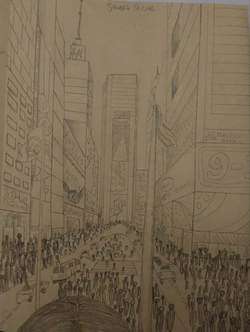
Street Scene:
This is a sketch of Times Square in New York City right before Christmas. I based this sketch off of a picture I took over my friend's head while standing on the steps in Times Square. The most difficult part for me was drawing all of the people and the cars. It also took a lot of patience to draw all the lines and make sure nothing looked too wonky.
This is a sketch of Times Square in New York City right before Christmas. I based this sketch off of a picture I took over my friend's head while standing on the steps in Times Square. The most difficult part for me was drawing all of the people and the cars. It also took a lot of patience to draw all the lines and make sure nothing looked too wonky.
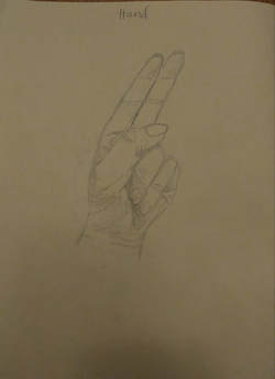
Hand:
This is a sketch that I did of my left hand doing a sign language "h." The most difficult part for me was drawing all of the lines and creases in my hand and making sure they all had value.
This is a sketch that I did of my left hand doing a sign language "h." The most difficult part for me was drawing all of the lines and creases in my hand and making sure they all had value.
Intro to Pen and Ink - January 29th, 2018
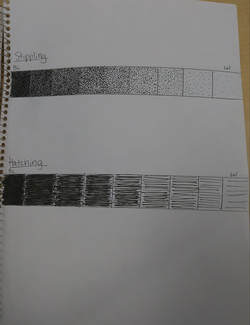
I made nine different values using both the stippling and the hatching technique. The most difficult part was most likely the stippling - it took a lot of patience and you had to focus in order to make sure the dots were round and didn't have any tails.
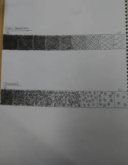
I also made nine different values using the cross-hatching technique and an invented technique that I chose. The invented technique I chose utilized stars. The stars were more difficult than the cross-hatching, because they were more complicated to draw repeatedly rather then just straight lines.
Pen and Ink Techniques - February 1st, 2018
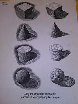
I practiced stippling on this worksheet, working on noticing where the different values were located on the different shapes.
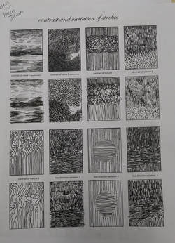
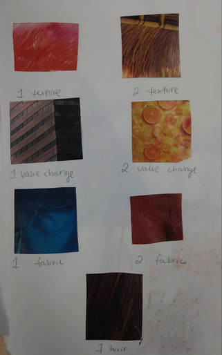
This worksheet was practice on different types of textures and values within these textures.
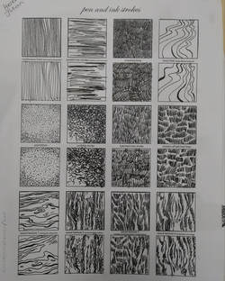
This worksheet was practice on different types of textures and the patterns and groupings in which they occur.
Pen and Ink Patterns
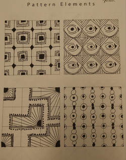
We had to create four different repeating patterns. This was difficult for me because I often wanted to misplace where the patterns are supposed to go on the grid. I messed up on the first one.
With these four patterns, we had to continue what was already started on the worksheet. These were easier because they were already started for us.
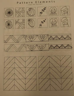
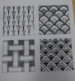
These were exercises to build our patterning skills. These weren't too bad compared to the previous worksheets.
|
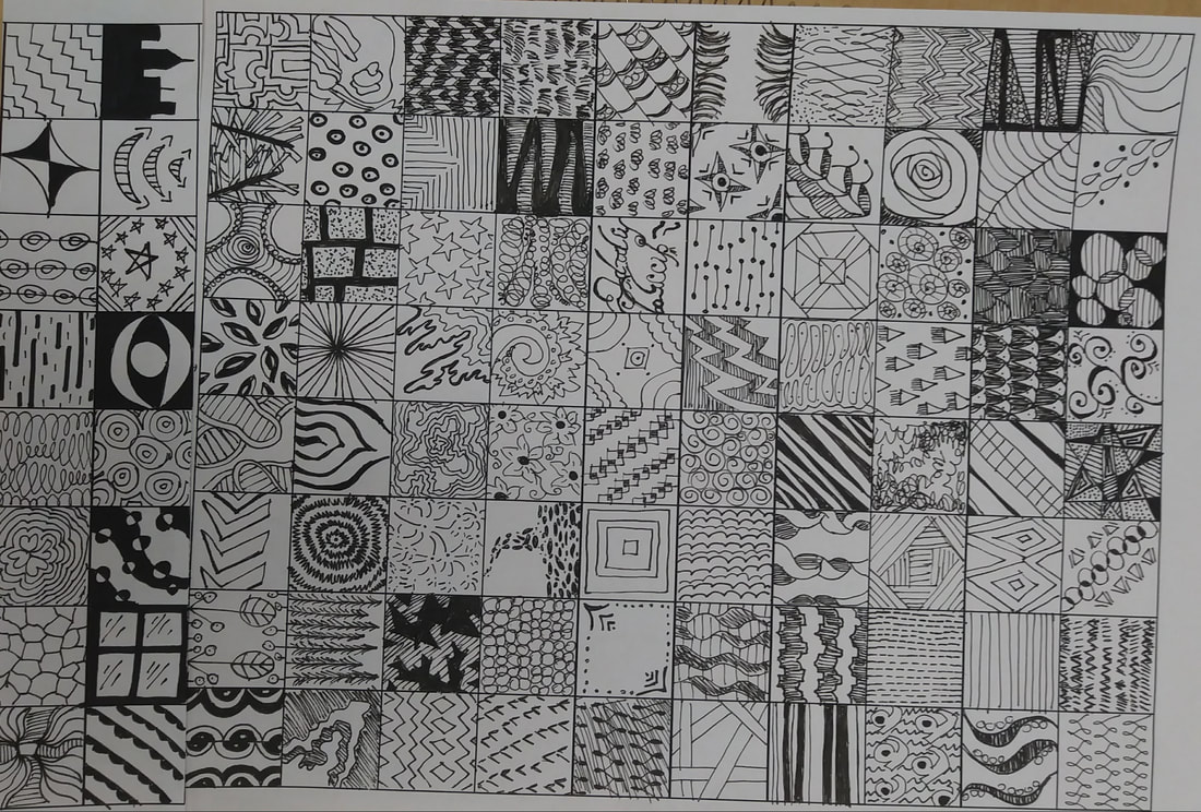
These are my 100 patterns that I created. I used elements of textures in the classroom, on Pinterest, and from my own memory. It started to get difficult when it got down to the last 20 patterns. I really had to borrow patterns from other people near the end.
|
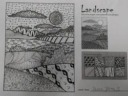
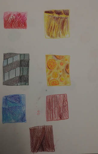
This worksheet was an exercise we did to practice different textures and values in preparation for our final project. For me, the hardest part was creating the values, because it can be difficult with some patterns to show value.
Watercolor Techniques
|
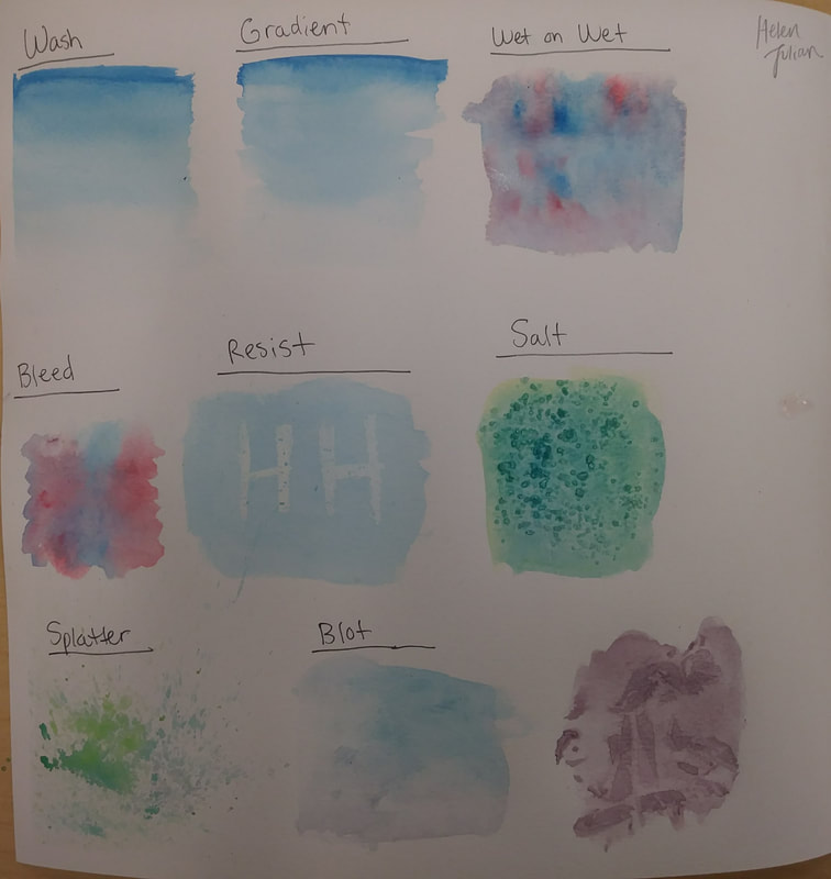
These are my different watercolor techniques. I found the hardest technique to be the wash, because it was important to keep track of how much water is used for each value. The easiest was the salt technique, however it's important to keep track of where the salt lands and to use it sparingly.
|
|
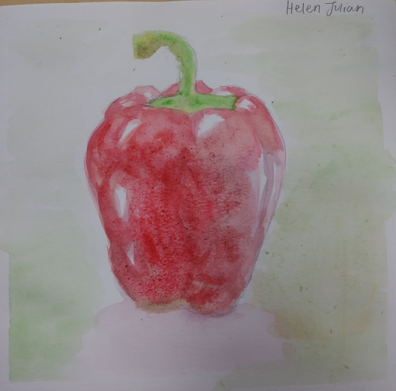
This is my watercolor painting of a red pepper. For me, the hardest part was making sure all of the values are aligned correctly. It was difficult to keep the highlights from having paint bleed onto them as well. I also went over the paper too much - some of it started to roll up in little pieces from too much water. Overall, I feel like the painting is somewhat successful. I need more watercolor practice to build craftsmanship.
|
|
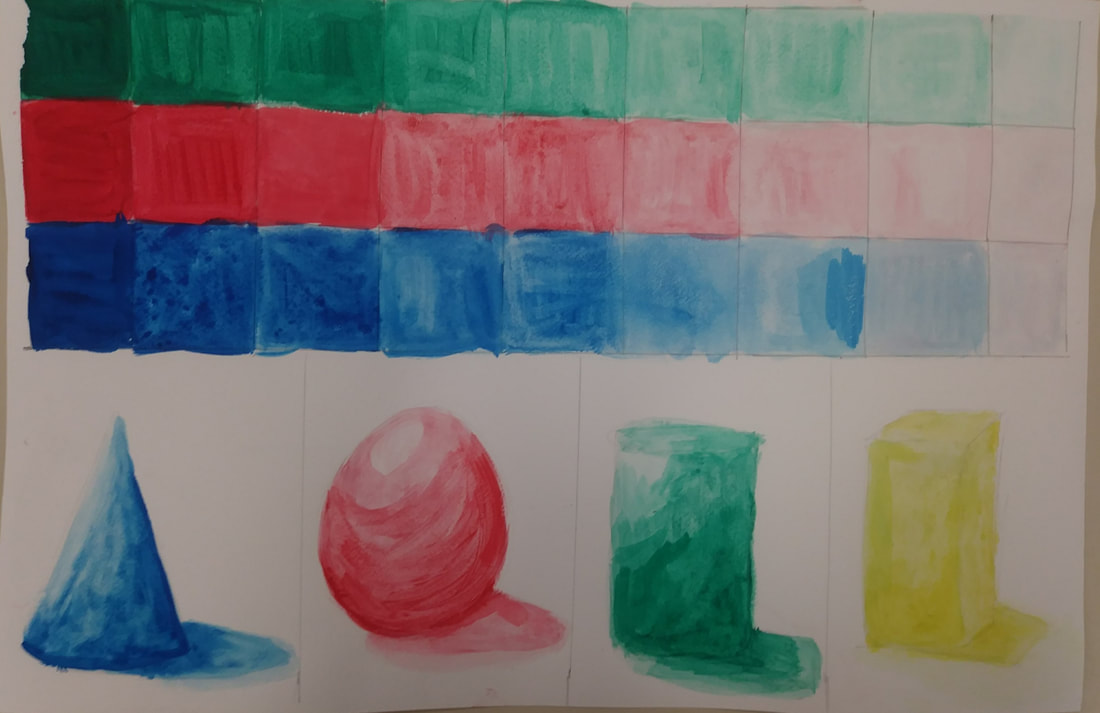
These are my three different colors using nine different values. I struggled a little bit to differentiate the values from one another, because there were so many of them. This turned out to be helpful, however when making some of my other paintings. I had some practice creating different values. The shapes were more difficult for me. It was hard to make them appear smooth - all my brush strokes are still visible. I fell that my best shape was the cone, because I had the most change in value and the brush strokes weren't too pronounced.
|
|
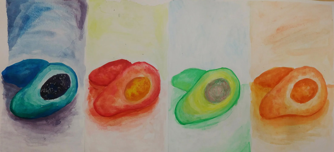
These are my four avocados. The first one was created using cool colors and I believe that it's my sloppiest one. I don't have as much value change as I would have liked and the background strokes could have been blended more smoothly. I also added salt into this one, however, I didn't get the desired effect because I didn't use enough water. The second one was painted with warm colors. This one was much more defined than the cool color one. It also was blended a bit better, but I don't have a complete range of value. The next one is the neatest, because I used watercolor pencils. This one, however, has the least value range out of all of them. The orange one was my monochromatic painting. This one has a better value range, because it had to be more defined in order to give the avocado shape. I believe that my best two avocados are the warm color one and the monochromatic orange one.
|
Prismacolor Techniques
|
|
The first Prismacolor exercise we had was to pick 7 patterns from a magazine and sketch them. I struggled a little bit with this, because I hadn't really used Prismacolors before and was getting used to the technique. I feel that I could have been more careful in my drawings. I also think that I did better when it came to the more flat/smooth textures rather than the bumpy/more organic textures.
|
|
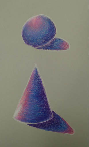
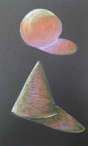
The next Prismacolor exercise we did involved drawing both a sphere and a cone using different colors and creating value. I found this to be difficult, especially on my first attempt (picture on the right). However, it came easier the second time around (picture on the left). One thing I did really struggle with was the cast shadow. To me, it looked more like a sticker on the floor rather than a shadow.
|
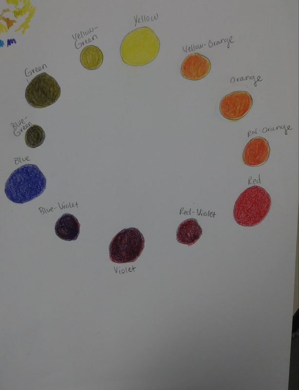
Before we started our portrait project, we made a color wheel using only red, blue, and yellow. This was more difficult than the previous exercises, because we could only use the three primary colors. I feel that I could have made my color wheel have more gradual changes than it currently does. I felt that the hardest colors to create were the yellow-orange, orange, and red-orange. I think this is because red is such a strong color, whereas yellow is not. Therefore, they were extremely difficult to blend evenly.
|
Intro to Acrylic
|
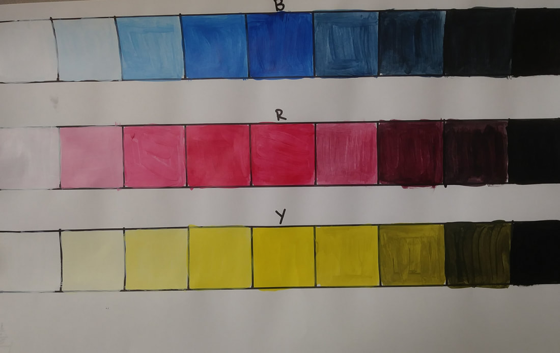
We created a value chart using the three primary colors. The hardest part of this was making sure that the colors progressed from white to black in an even gradient. I found mixing the colors with black to be more difficult than mixing with white, because the black washed out the color more easily.
|
|
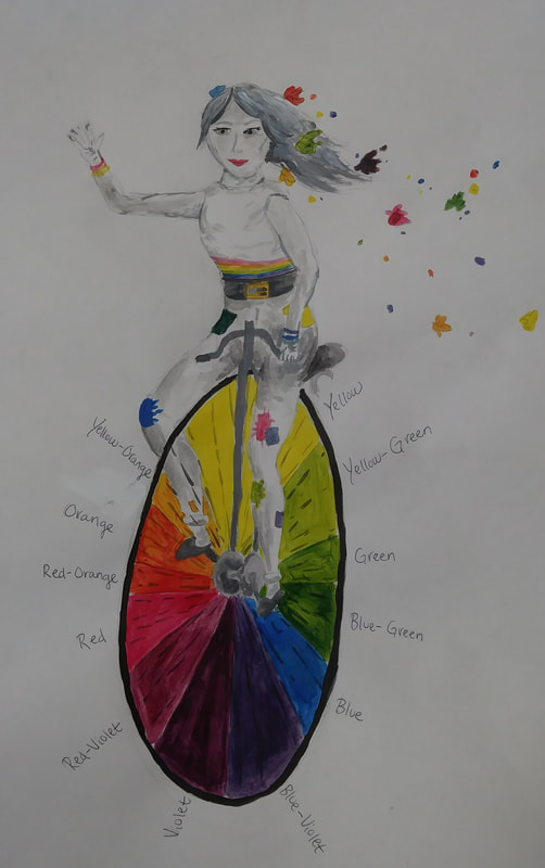
For one assign, we had to draw a creative color wheel. I decided to draw a girl on a unicycle, with the unicycle wheel being the color wheel. The girl I decided to paint in a gray scale with various bursts of color on her outfit.
|
|
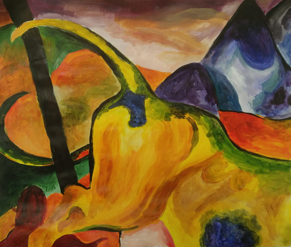
This was my piece of a larger painting that I painted. This is the upper left quarter of the painting, Yellow Cow by Franz Marc. The hardest part for me was mixing the colors. Whenever I wanted to start painting a new color, I had to look closely at the painting and see how I was going to mix the colors to create it.
|
|
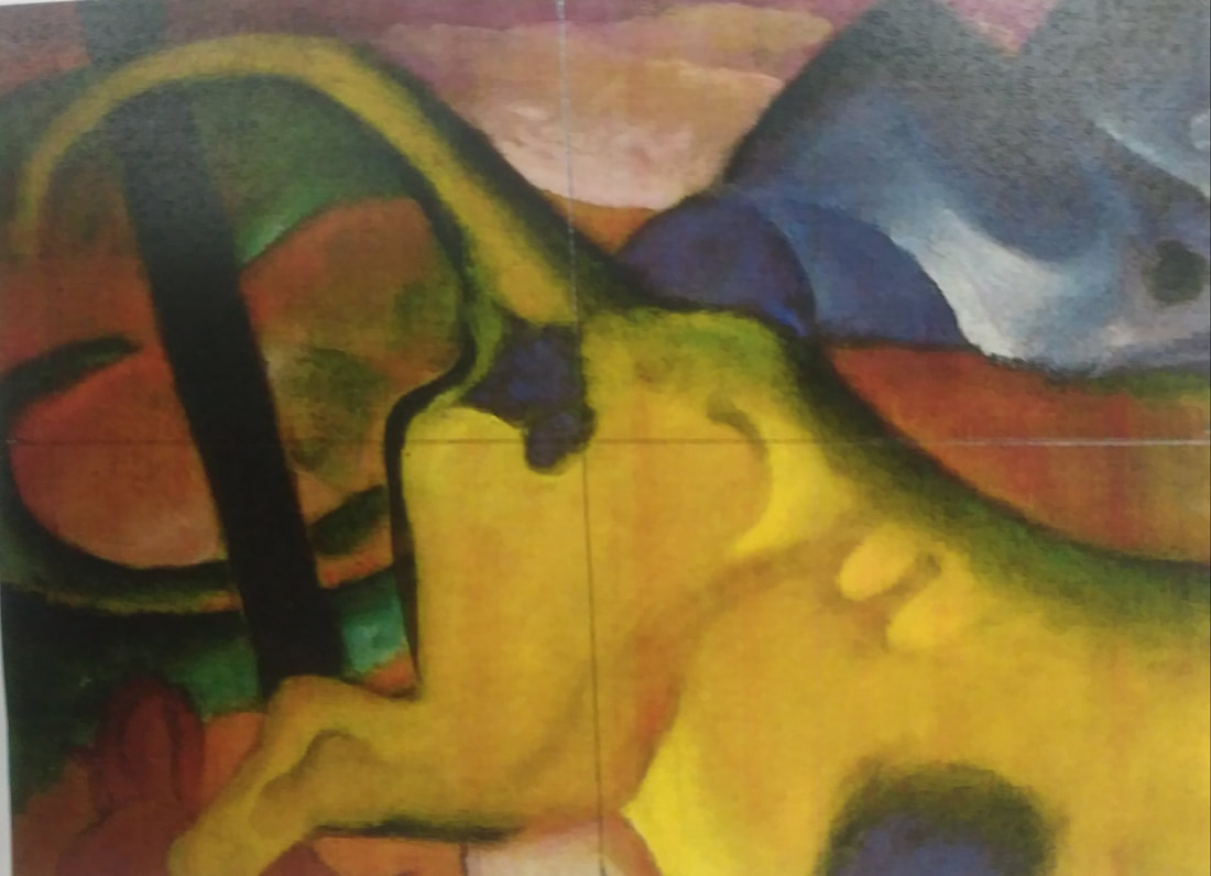
This is the original piece of the top left corner of Yellow Cow.
|
Artist Research
Richard Hamilton - He is considered to be the founder of pop art. His work was first created in the 1950s and attempted to capture the energy of the television. It also highlighted consumerism and attempted to bridge the gap between high art and everyday consumerism. His pieces are known for being very eclectic and collage-like and making use of a variety of colors. He took pieces from newspapers, magazines, and painted some of it his own. He also used disruptive edges and added things to pieces that didn't seem to fit entirely with the scene or exaggerated a certain aspect of it. Many of the colors he used were more muted or dull, but he used a variety of them.
James Rosenquist - He was an influential artist within the pop art movement. He is known for creating large paintings and pieces. He used a bright, variety of colors and patterns. Like many other pop artists, he explored the roles of advertising and consumerism within society. Many of his pieces also used elements of surrealism. He also made use of disruptive lines and shapes to create scrambled-looking images. An example would be his piece, Zone.
James Rosenquist - He was an influential artist within the pop art movement. He is known for creating large paintings and pieces. He used a bright, variety of colors and patterns. Like many other pop artists, he explored the roles of advertising and consumerism within society. Many of his pieces also used elements of surrealism. He also made use of disruptive lines and shapes to create scrambled-looking images. An example would be his piece, Zone.
