Pen and Ink Project
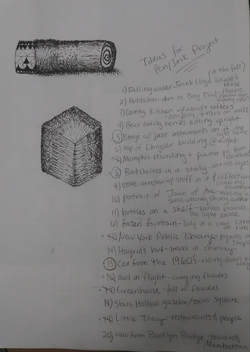
This is a page from my sketchbook that has the practice sketches of a cylinder with different textures and a square with a light source facing directly at it. There is also a list of my 20 original ideas. My final two were a bookshelf in a study and a car from the 1960's. I chose to draw the car for the project.
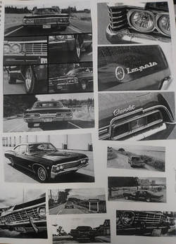
These are the reference pictures I compiled off of Pinterest and cropped to certain sizes in order to focus in on different parts of the car. The type of car that I chose was a black 1967 Chevrolet Impala.
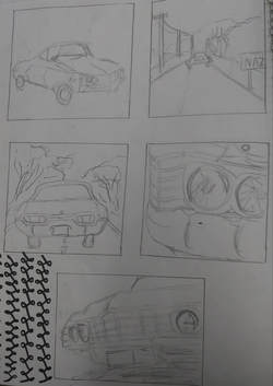
These are the five compositional sketches that I did for my project. I decided to turn the fifth sketch at the bottom of the page into my final project, because I believe that it had the most compositional value.
|
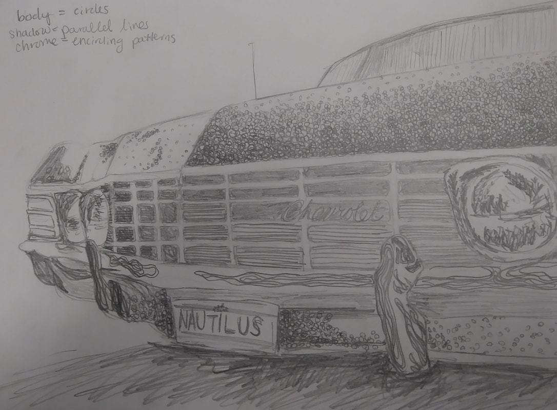
This was my final sketch after I chose the fifth compositional sketch. I planned out which patterns I was going use to create value in my drawing. I decided to use circle for the body of the car, because I am amble to do a wide range of value with them. I used the repetitive lines that reflect each other for the chrome plating, because this is similar to how chrome actually reflects objects in real life. Inside the headlights, I used triangles and arrows, because the actual textures of the lights is sort of spiked. The background I left undecided, because I felt that I first needed to get the car drawn in pen in order to proceed. I could then see what backgrounds would take away from the car and which ones would flow nicely with it.
|
|
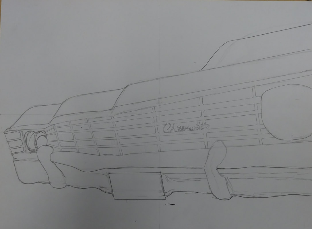
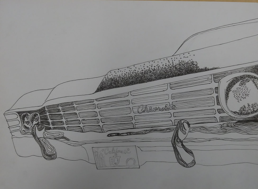
This was the first sketch I did in pencil for the final drawing. I decided to elongate the car itself from my original sketch and I made sure to use a ruler on many of the lines of the car's body. The next day, when I decided to start adding in the ink, I first made the hood of the car a bit wider after looking at my reference photo. I also started on my patterns, filling in the grill with parallel lines. I chose to use parallel lines, because I felt that they helped elongate the front of the car, and I could easily utilize them to provide contrasting value. The middle had the lightest value while the edges were darker. I also filled in the headlights and the chrome plating of the bumper. During this part of the process, I also designed the license plate of the car. I decided to give the car California plates, because it's starting to get warmer outside and it makes me wish I could go to California (because, why not?). The letters on the plate are just my first and last initial.
|
|
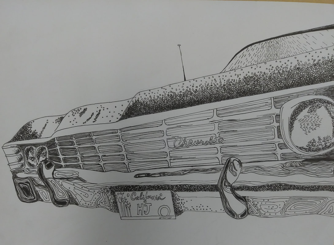
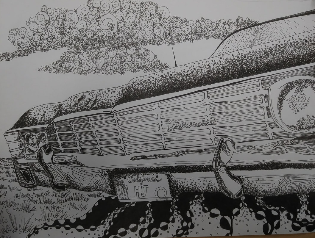
In this stage of the project, I finished up the body of the car. I still add little touch-ups throughout the process (such as making the hood of the car much darker all the way across), but for the most part, the body of the car is done. I add vertical, slanted lines to the windshield to show the direction light reflects off of it and I finished up the bottom part of the bumper, adding in parallel hugging lines on the chrome and more circles as shading.
In the next stage, I added in the shadow of the car. I knew for the shadow that i wanted to do something blockier rather than fine details, because the car has such fine details. To have a shadow that had similar patterns to the car itself would take away from the car and wash it out. I chose the pattern of wavy lines with circles on them from my 100 patterns chart. I made the black lines thicker closer to the car, because the shadow there would be darker and the black lines were thinner further away from the car, The circles were larger near the bottom, because they would appear more stretched out as the shadow elongates away from the car. |
|
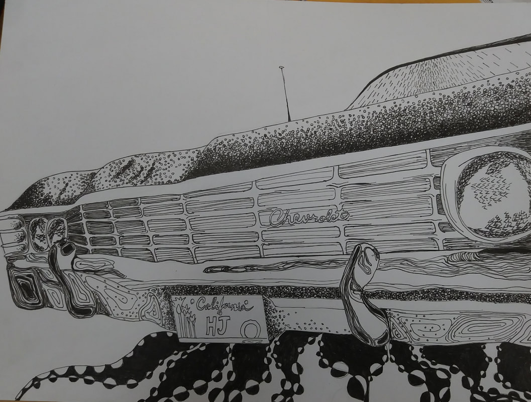
In this stage, I focused mostly on the background of the composition. I added circles to the shadow to tie it in with the car more. I added grass to the ground, pulling the pattern from the 100 pattern sheet. The grass in the background is smaller and closer together further away. It gets larger and more spread out the further it gets into the foreground. For the sky, I added in clouds made from a swirly pattern. The smaller swirls closer together showed shading while the larger, more spread out swirls showed lighter parts of the cloud. In the final picture of the project underneath, I added more clouds into the sky and did finishing touches on the values throughout the piece.
|
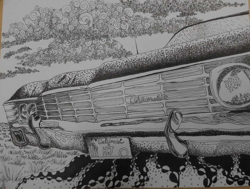
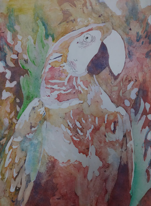
This is my final composition:
Self Evaluation - Pen and Ink Project:
1) I arranged my composition by having the car go back in space rather than viewing it from straight on. I also made sure the center of the car was not placed in the dead-center of the paper, placing it more to the left of the center line. I also used varying size within the piece. The headlights on opposite sides of the car are different sizes, because they occupy different spaces on the plane of the picture. I believe that it is a successful composition, because the eye follows the slope of the car through the paper and up into the clouds.
2) Texture and pattern are important in my composition, because there are so many different types of surfaces in the piece and I wanted to represent all of them in ways that they stood out from one another. I had to think about what types o patterns were placed in certain areas (complicated vs. basic, light vs. dark) in order to accentuate the different surfaces within the piece rather than muddle them all together.
3) Value is very important in this project, because we are not using color to show the different between objects. Also, in order to display craftsmanship, we must demonstrate in our piece that we don't see shapes because there's a line around them, but because there are differences in value that bring out the shapes. This was very important to remember. It's also important to have enough contrast within the piece in order to make it dynamic and interesting.
4) In regards to the craftsmanship, I feel that the straight lines could have been done, well, straighter. My hand is not super steady, so I could have taken more precautions in making sure the final ink lines were straight. I also could have been more precise with some of the smaller, finer patterns that I used in the piece. For example, the grass could have been neater and the lines on the windshield as well. However, I don't feel like these things take away too much from the overall composition.
5) I feel that all the practice with pen and ink that we did leading up the final project allowed me to really solidify the skill of value and contrast. I had many examples and many patterns that I could use as a reference in many different values, so it made it easier to carry this through into the final.
6) It's important to understand the concepts taught in class, because it becomes blatantly apparent on the final if you didn't understand or practice a certain skill. Also, if you don't have all parts of the lesson under control, starting a new composition can seem incredibly daunting. Blank pages can be one of the most scary things in a classroom (whether it be math homework, an essay paper, or a sheet for an art project), therefore it's important to make sure you have the tools you need to get started.
7) I feel that the number one thing that this project taught me was patience. I will be able to carry this though into my other projects (especially with watercolor), because it's important to take your time. If you don't, the final project could end up being sloppy.
8) If I could recreate my piece, I would plan out all the patterns from the beginning. I found myself doubting my decisions once I'd started because I hadn't all the way planned out the background. This made me uncertain whether something would look good with the car or if it would take away from it overall. I also got slightly impatient with the project at the end, because I'd been working on it for so many days, so maybe I should have slowed down a bit more. That way, I could have added finishing touches at home and not rushed myself.
Watercolor Project
|
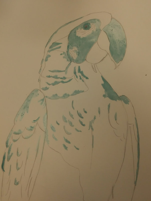
I decided to draw a parrot for my watercolor project. The day before the guest artist came, I put masking fluid on the parts of the bird I wanted to keep white. I used reference images from Google to sketch the bird and figure out which values to use in which places.
|
|
The technique taught to us by the visiting artists, Ryan Fox, involved puring colors onto the paper and allowing them to run together using gravity. I tilted the paper to roughly move the colors around in a way I wanted them to go. Once this layer of paint had dried, I used another layer of masking fluid to add features into the background and add a second value into the parrot itself.
|
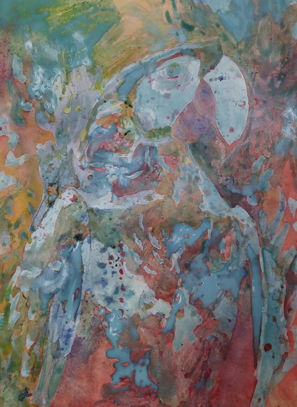
|
This next step involved adding more layers of watercolor and more layers of the masking fluid to create multiple values. In this stage, I was more conscious of which colors were going to which places. I especially emphasized making sure the red went onto the parrot's body.
|
|
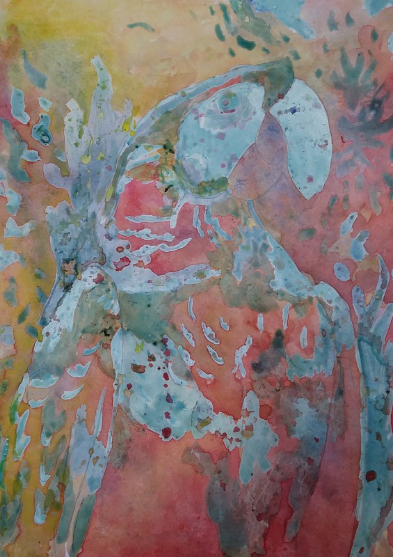
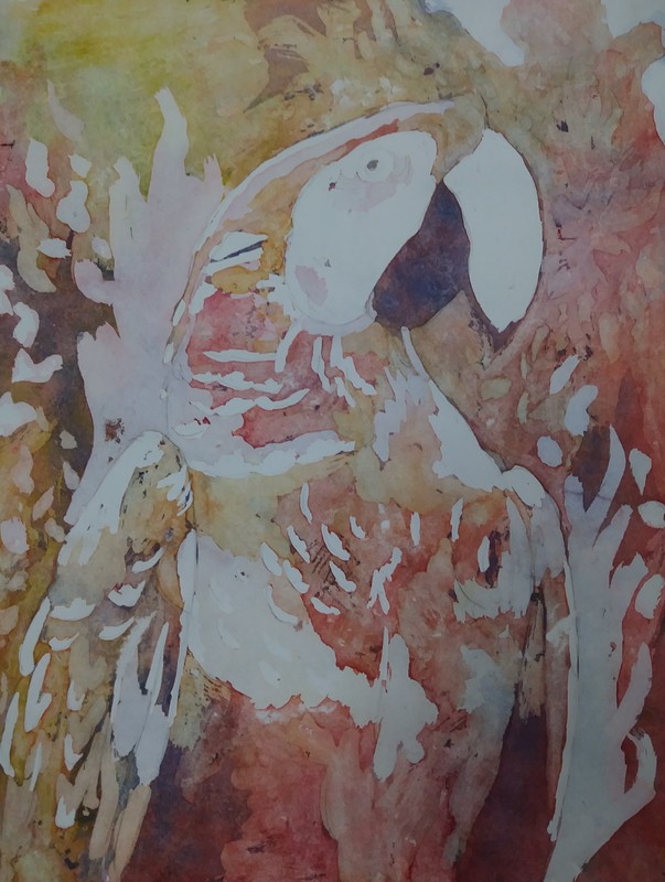
This is what my painting looked like right after peeling off the masking fluid. I really liked how the colors were all uniform and fir together, because they were created by combining multiple layers of the same three colors. However, I noticed the colors were kind of dull. Watercolor dries much lighter than it is applied, therefore it came out a lot lighter than I had anticipated.
|
|
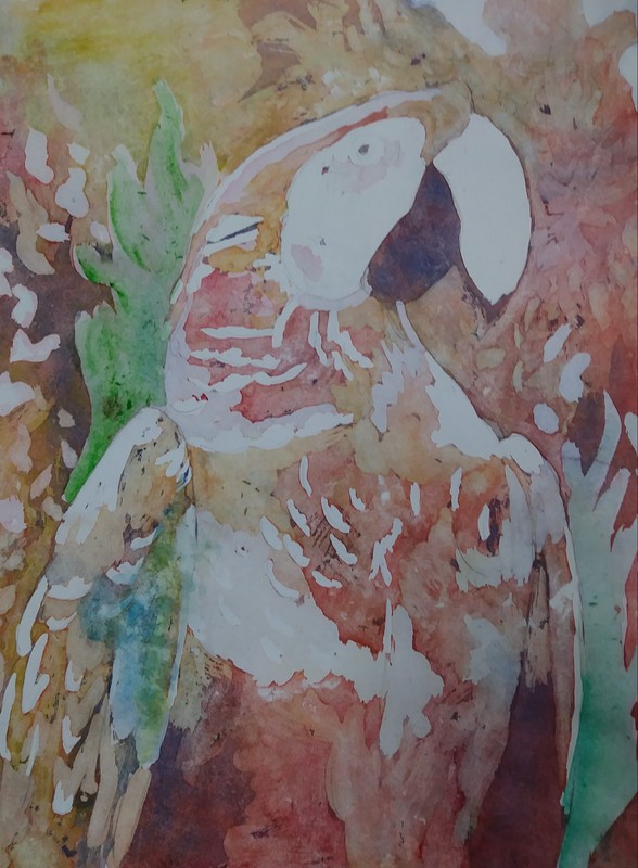
In this step, I attempted to touch up some of the light colors. I added green to the plant fronds in the background, which I liked as they popped the parrot and distinguished the background from the bird itself. I also attempted to add some blue and yellow to the wing, however, I didn't like the colors added. They didn't fit in well with the rest of the picture, and I didn't think ahead too clearly before adding in the touch-ups. I blotted out the color as much as I could without taking out the original colors.
|
|
In order to try and combat the accented blue I had erroneously added to my painting, I added some blue in the background. This drew some of the emphasis from my mistake and distributed the color more evenly throughout the piece. I also used a Micron pen to draw in the eye and the wrinkles on the parrot's face. Overall, I would say that I am happy with my painting, I simply wish I hadn't added the blue to the wing.
|
Self Evaluation - Watercolor Project
1) To create this project, I had to think a lot about value. With watercolor and especially with the technique used, there was no way to redo something once the paint and the masking fluid was applied. I first started by sketching the parrot, using a reference image I found off of Google. I used the image to get a feel for where the different values should be located on the the bird. I first applied a layer of masking fluid to preserve the lightest value. Afterwards, I applied a lot of red and blue paint with a little bit of yellow. The result was a fluid blend of purples, yellows, and reds. I used my finger to blend the blunt edges between the colors. I then repeated this process, adding multiple layers of paint and masking fluid, making sure to pay attention to the values used in the picture of the parrot.
2) My greatest difficulty was controlling where the paint went. After the first couple of larger washes, I wanted to make sure the colors were located in the correct places in terms of the colors I wanted in the bird's feathers. I also struggled with the values in the background. I feel like the background was too similar to bird itself. If I were to use this technique again, I would make the background look might lighter in comparison to the subject of the piece.
3) I learned that value is one of the most important things in watercolor. I also learned that it's okay for watercolor to not be precise. Part of the look and feel of watercolor is the blended simplicity that comes with the style. While you must be aware of where your water and paint is going, it's okay if it runs away from you a little bit. I also learned that you really have to think before introducing a new color to a piece. I added some blue in the wing of the bird after removing all the masking fluid, and it immediately didn't match with the rest of the picture. It's important to really evaluate with colors are already in your piece and which ones would accent it versus take away from it. One last thing I learned was that you must remove masking fluid carefully. I feel like I was too rough when removing it, and it caused some of my paint to fade. I will remember these things for the future.
4) I would not add the accent colors that I added at the end. The faded look is part of the technique and style of this assignment, and it wasn't necessarily needed for me to add these colors. To prevent some of the fading in the first place, I would be more careful when removing the masking fluid. I would also use less layers of paint in the background and more layers in the bird itself.
5) I used layers to create a successful piece by adding a full range of values. For texture, I tried to make the layers of the masking fluid appear choppy rather than smooth, straight layers to try to give the impression of feathers. In the future, I think I should pay a little bit more attention to texture, to ensure that the subject and background don't look too similar. Color was a little bit more difficult to control than the other two. I avoided using the green, because I knew it would clash with the three primary colors to create icky-looking browns. Instead, I simply used the three primary colors and allowed them to mix themselves on my paper. I emphasized red more on the body of the bird and yellow in the background. I also added some green into the piece after I'd removed the masking fluid, so I could limit the green to just touching the fronds in the background.
6) I feel that the mini watercolor lessons were useful, because I did not have much practice with watercolor almost at all. It allowed me especially to get accustomed to creating values. It also allowed me to practice starting lighter and then gradually adding layers to darken the piece rather than trying to start dark and pull the light out of it.
7) Having a guest artists was a very positive experience. It was awesome to see a professional artist and to see that art is a career that is feasible. It was also cool to see everything that can be done with the technique. The paintings done by the guest artists were incredible and really demonstrated what is possible through practice with the technique we learned. It was also nice to have the artist there as someone who could answer questions from a professional perspective. He also allowed us to use some of his high-quality paints, which really made the color on my piece pop.
8) I learned that in order to make a living, you really have to practice a lot. It's not just a hobby that you do on the side, it's what you are devoting your main energy to every day. I also learned that it's okay for a professional to mess up. He said that some of his paintings don't turn out to his liking. He also mentioned that some of the other artists in the building that he works in mess up while creating art. I also learned that as a professional artist, you're creating art for a full day of work. It's not just an hour here and an hour there, it's a full day of work. But, as the artist said, it's something that is fulfilling and "doesn't suck."
3 Color Self Portrait Project
|
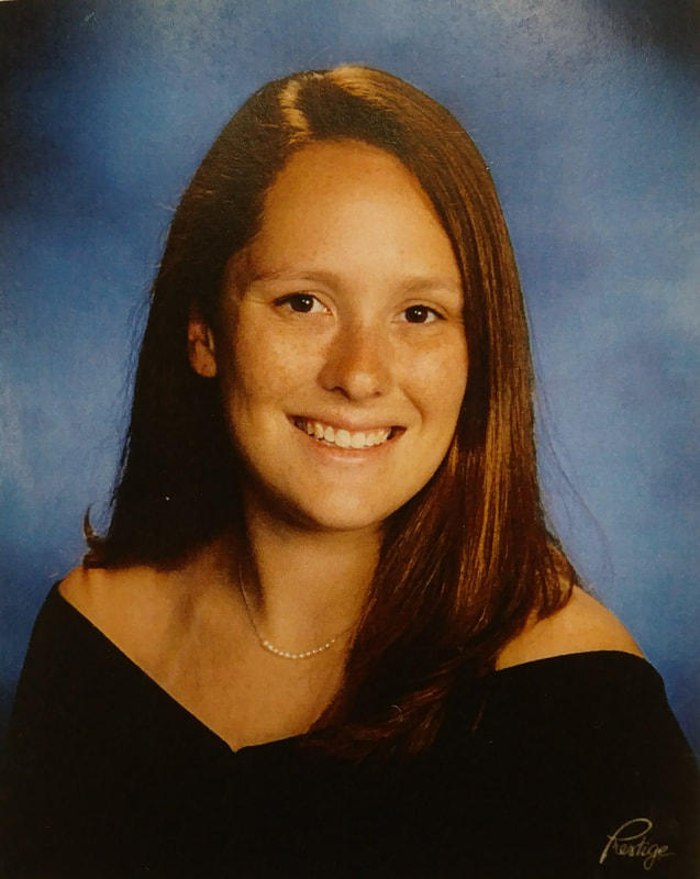
I decided to draw my senior portrait, because I don't have very many close-up pictures of my face. Also, my hair looks halfway decent in this picture, so I decided it would be a good one to draw. It's not the most interesting picture ever taken of me, but it is close enough to my face.
|
|
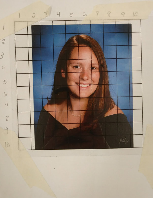
Once placing my grid over my portrait, I realized the picture itself was too small. The problem was, however, that I made the copy of my picture at OfficeMax over the weekend and didn't have a copy of the picture on-hand. I decided to expand the background to fill in the extra space.
|
|
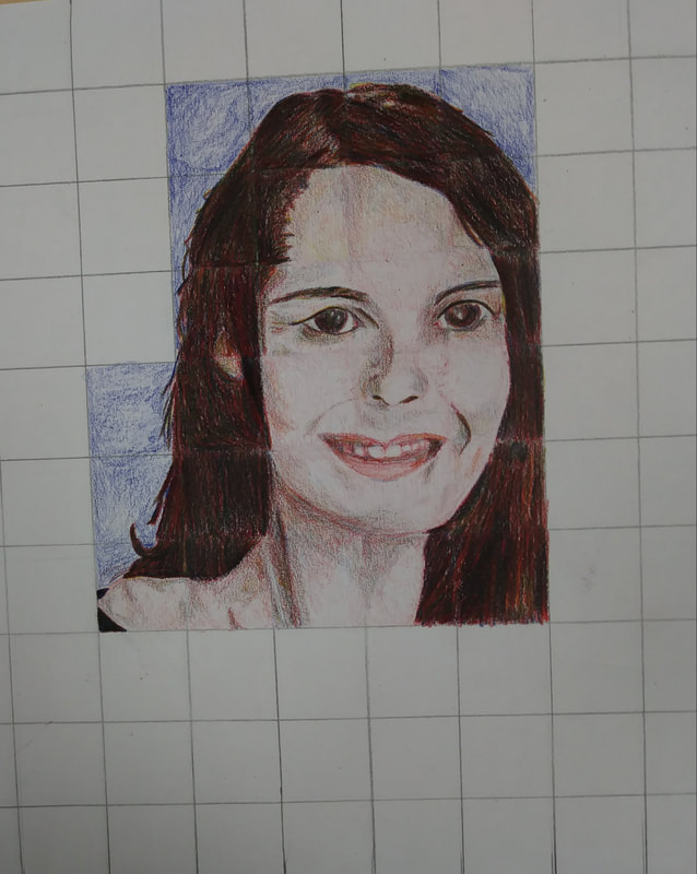
This was the progress I had made after my first day of work. I found blending the colors to be not quite as difficult as I had expected. I also found it difficult to place the facial features exactly where they were located in the square. The face didn't end up looking exactly like me. Next time, I would take extra care to pay attention where each thing is placed within the square.
|
|
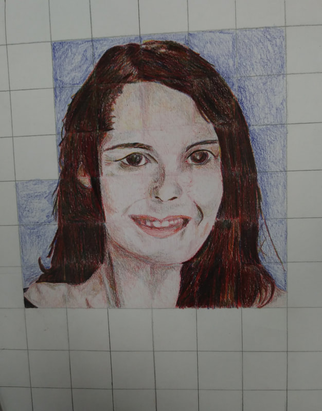
The next steps I took were to finish my hair on the side of my head. The hair was the most fun part of the drawing for me. I used a lot more of my Prismacolor pencils than I thought I would. I usually colored it by doing an underlayer of red and then layering blue and yellow over it in at least two layers.
|
|
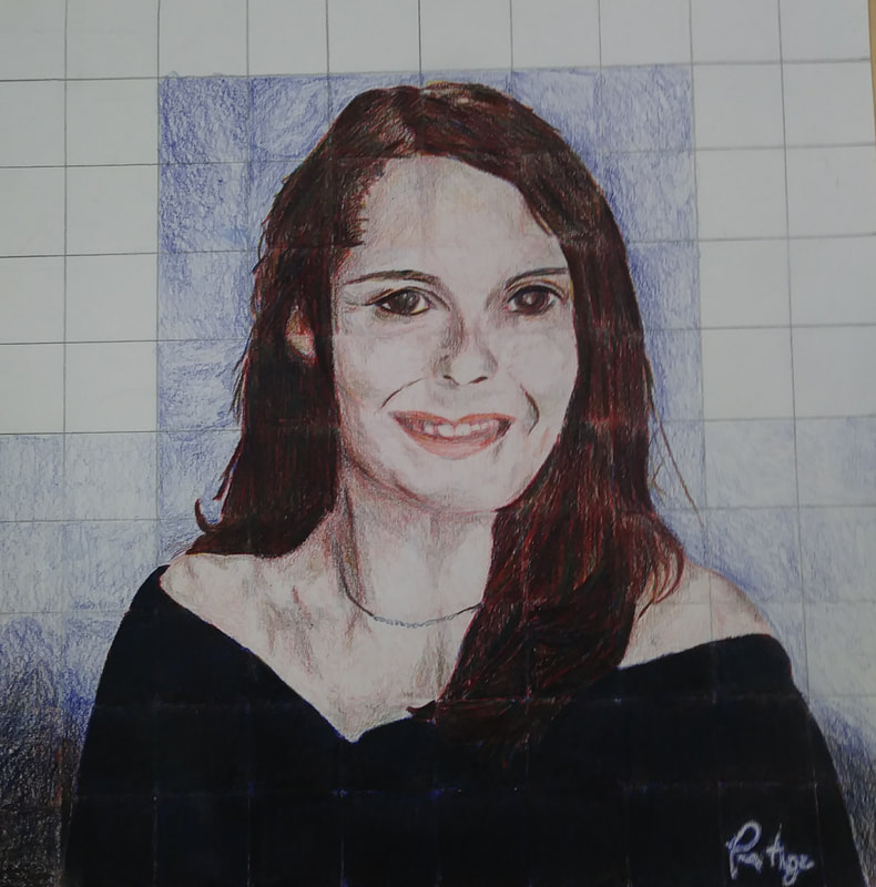
Once I finished drawing my head, I finished the squares that had the rest of my body before I started work on the background. The black took forever to draw. I started with an underlayer of blue and then layered red and yellow over it in at least three layers, always making sure the top layer was blue. This made the dress appear dark black in color even though I still only used red, blue, and yellow. I even added the photography company's watermark down in the corner of my portrait, because the whole logo was contained in one square.
|
|
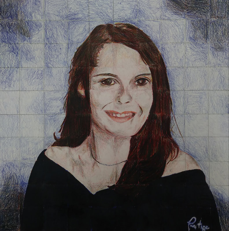
This is my final portrait. To create the background, I shaded it in various shades of blue, using red and yellow to add value. Overall, I think my portrait was successful, however, I wish it looked more like me. The skin color also isn't as vibrant as the original picture. That's also something that I would change if I could work on this project again. I also wish I had practiced drawing teeth before I started on this project. The mouth was one part of the project that I struggled with more than the other parts of it.
|

|

|
Self Evaluation - Prismacolor Project:
1) I believe that my portrait is neat, because I took the time to make sure I only added color where it was necessary. However, I don't think that it is as well-executed as it could be. I feel that my facial features are not completely in-line with what they are in the original photo. I also think that the colors in my skin are not as vibrant as they should be. In terms of craftsmanship overall, I would say that a moderate level is present, seeing as if someone did not know what I looked like, they might not realize the facial features were very far off from the target goal.
2) The biggest difficulty with blending colors that I encountered was the skin. I used only a light layer of red with blue and yellow used to ass value. However, I think this created a lackluster, dull look overall. My skin in the original photo is much more vibrant. If I could rework this piece, I would take care to add more color into the skin.
3) I did draw each square box-by-box for the most part. Sometimes, I would get carried away and continue a line beyond its box. I did take extra care to make sure I only drew one box at a time. This is important, because it allows the artist to focus on only a small section of the piece rather than getting scared of drawing the portrait as a whole. It also narrows your focus and forces you to draw what you see rather than what you think you see. If you can't see beyond what is in the square, you have to trust the colors and values you're seeing.
4) To create value changes, I simply added more layers of each of the three colors as needed. The darkest color, the black dress, was where I used the most layers (at least three) and drawing the skin is where I used the least (although I should have used more). I tended to use blue the most when it came to creating darker values, because I feel that it is the deepest color and really brought out the darkest shades. Yellow was used the least and was mainly an accent color.
5) To get the color I wanted using only 3 colors, I usually started with the primary color that was the closest to the color I was trying to create. This way, the base color supported all of the other layers that I added onto it. For example, when creating black, I used blue as the base color because I believed it was the closest to a deep blue hue. I layered the colors in my dreww until they became glossy. For my hair, I used a lot of layers until the color pencils took on a glossy texture. The color I used the most while drawing my hair was red. I sued it intermittently throughout all of the layers.
6) To improve my portrait, I could pay closer attention to where I am placing parts of my facial features while drawing the squares. This way, the portrait might come out looking a little bit more like me. I could also add more hues to my skin, making it more vibrant and colorful. I could do this by layering more red and yellow, with blue as a shade.
7) I feel that I wasn't as prepared for this project as I would have liked to be. I felt that I needed a bit more practice blending before starting my portrait. I feel that the most helpful exercises we did beforehand was the color wheel, because that one we did only using the three primary colors. We did practice creating textures and blending all kinds of colors, however I feel that it would have prepared me more to practice creating specific colors using only the three primary colors. The blending was one of the bigger challenges for me.
8) I feel that Tori's piece is an excellent example of mastering these techniques. She blended the colors together in a unique, colorful way that also managed to make the picture look realistic. She also was good at matching up the square she was drawing with the square in the grid on her photograph. The final drawing also ended up looking a lot like her. The picture she chose also had a cool perspective and wasn't just a straight, head-on portrait.
Clay Food Sculpture Project
|
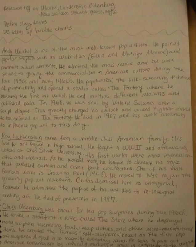
The first step in the process was to research various pop artists, their major works, and their artistic processes.
|
|
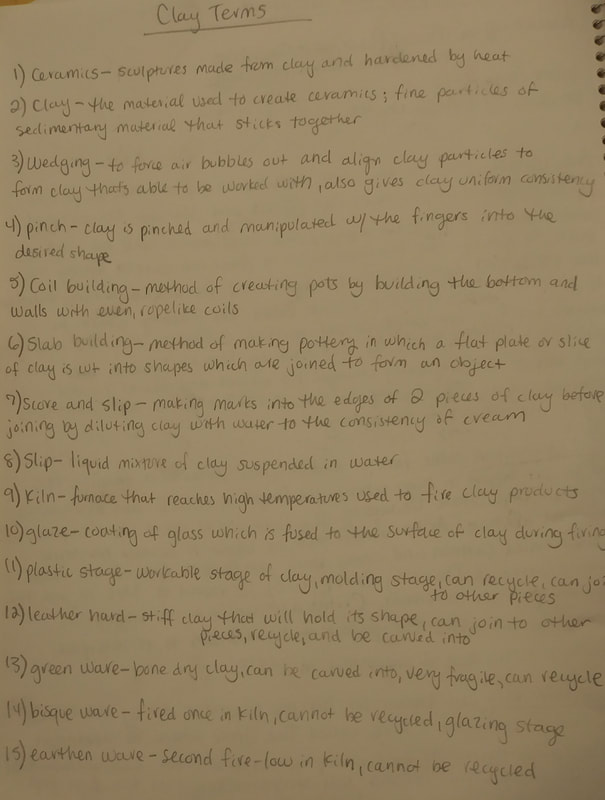
Next, we defined clay terms and learned about the various techniques we would have to use to complete our projects.
|
|
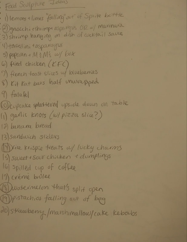
Next, I brainstormed a list of twenty ideas that I found interesting to sculpt. From this list, I selected 5 that I wanted to analyze more in depth (I circled the numbers of these in the list).
|
|
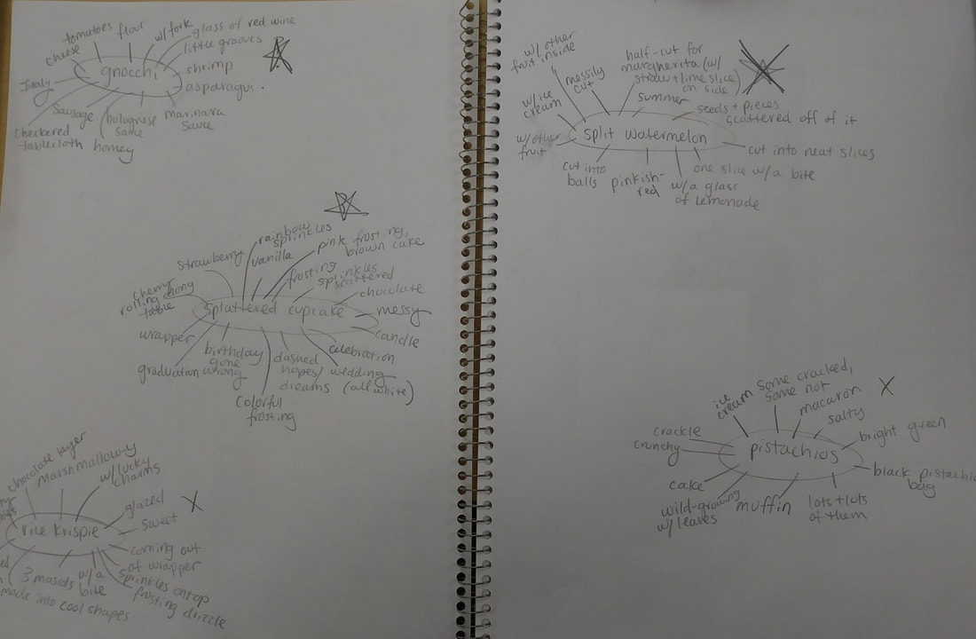
Following this, I made bubble charts of my five favorite ideas from the list and selected my two favorite of the five: gnocchi and a splattered cupcake.
|
|
|
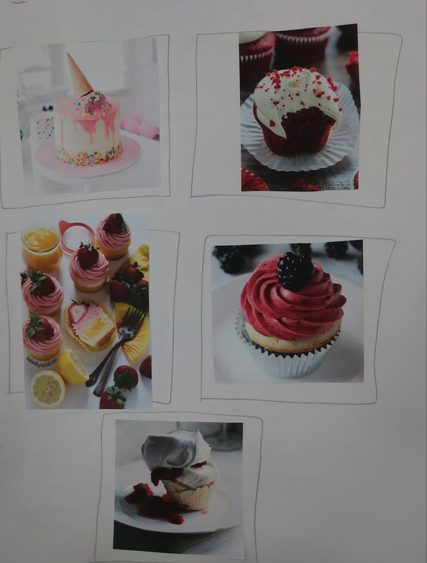
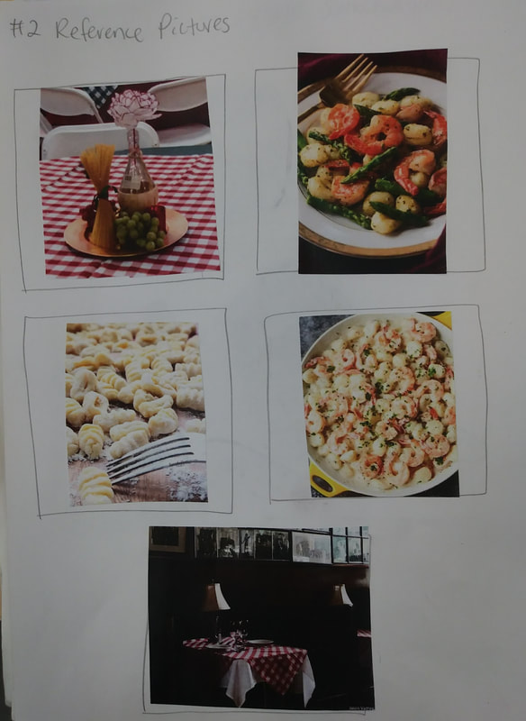
These were my five reference photos for my two favorite ideas. The photos for the splattered cupcake are on the left and the ones for the gnocchi dish are on the left.
|
|
|
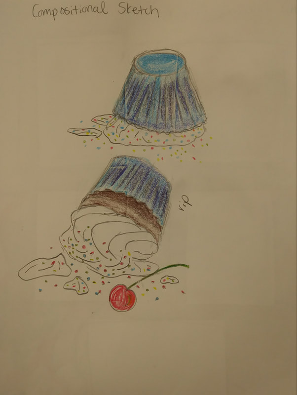
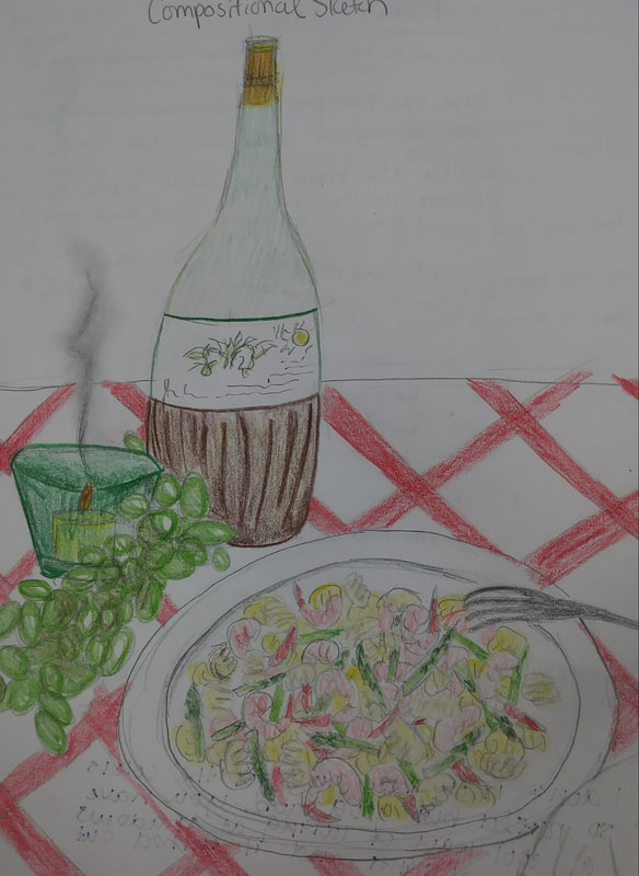
These are my compositional sketches in color for each of my ideas. I chose to do the one on the right, a place with gnocchi, asparagus, and shrimp.
|
|
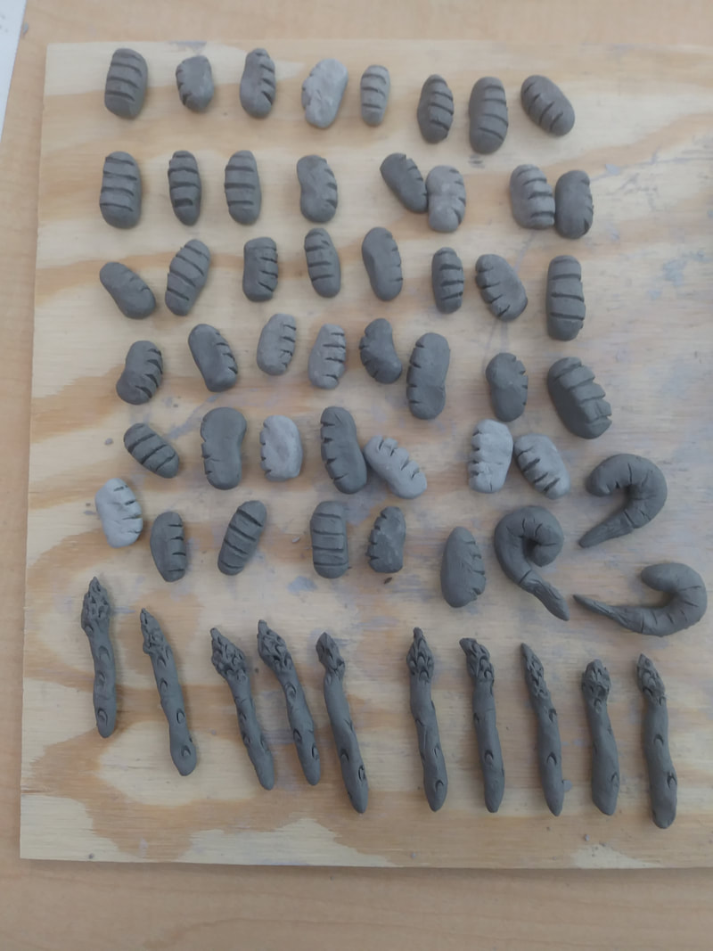
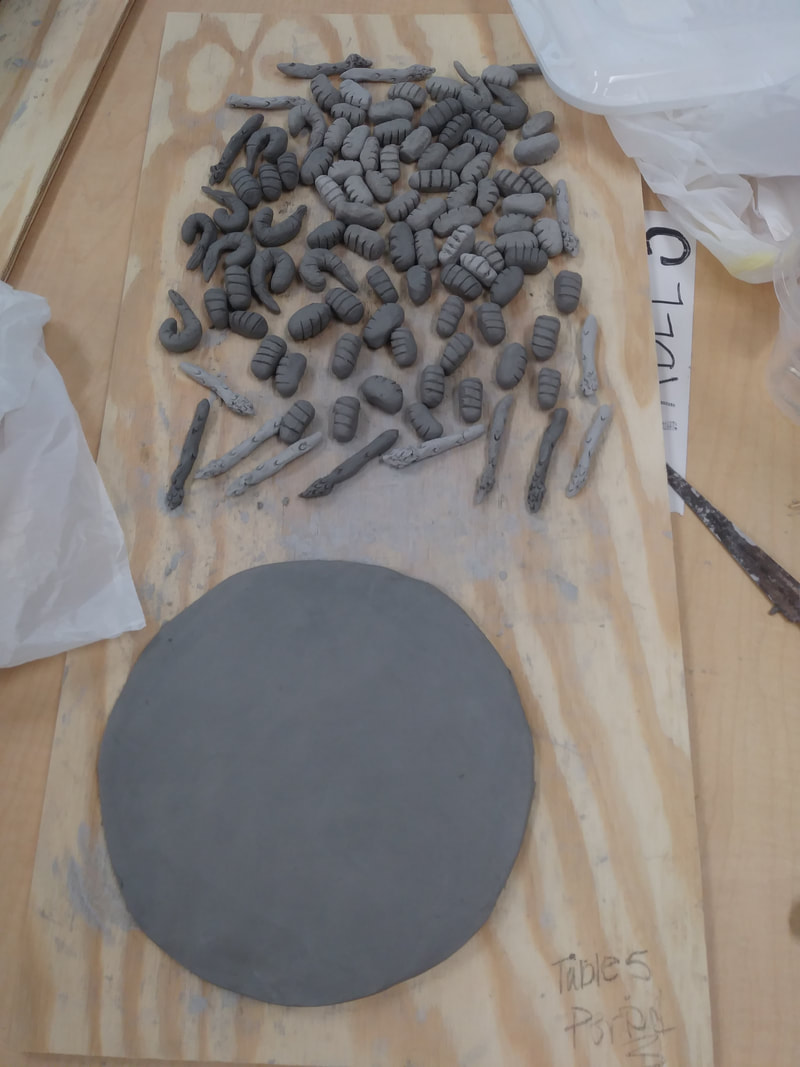
I made the gnocchi by rolling the clay in my palms into little spherical shapes. I then pinched them and elongated them as needed. To add the four little grooves on top, I just dragged my fingernail across the top. To make the asparagus, I rolled out little cylindrical shapes, making sure it was wider on one end. I then used one of the tools to add the texture of the asparagus. To make the shrimp, I also rolled them between my palms and then curved them. I made a smaller portion for the tail and then scored and slipped it to stay on. To add texture, I used my fingernail to add lines and grooves in the shrimp's body and tail. To make the plate, I created a slab and cut away the edges to make it more circular. I then rolled a long snake-like tube and scored and slipped it to the edges. I then smoothed out the edges and angled it like a normal plate.
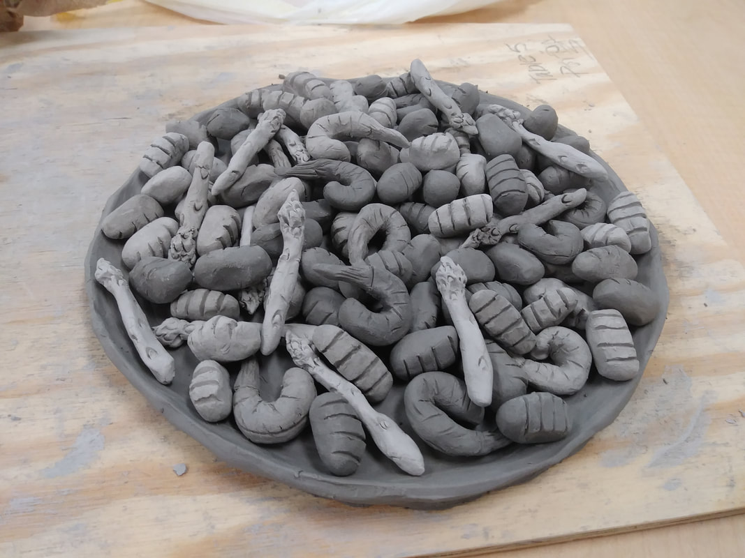
This was a photo I took of all the gnocchi, asparagus, and shrimp on the plate. For the final presentation, I think I'm going to bring in a red and white tablecloth and maybe silverware and a napkin.
|
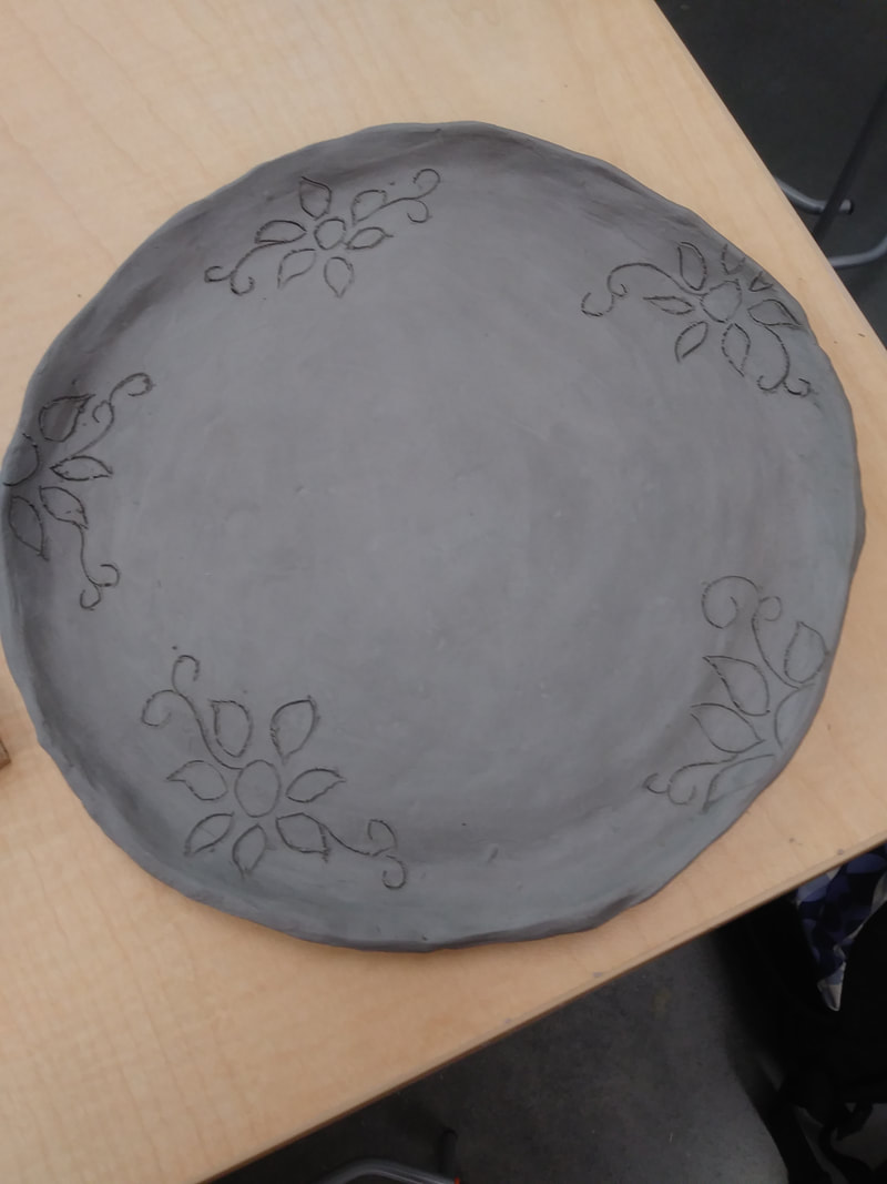
For the finishing touches on the plate, I added five floral designs along the edge of the plate. After I did this, I decided to fire all of my pieces in the kiln.
|
|
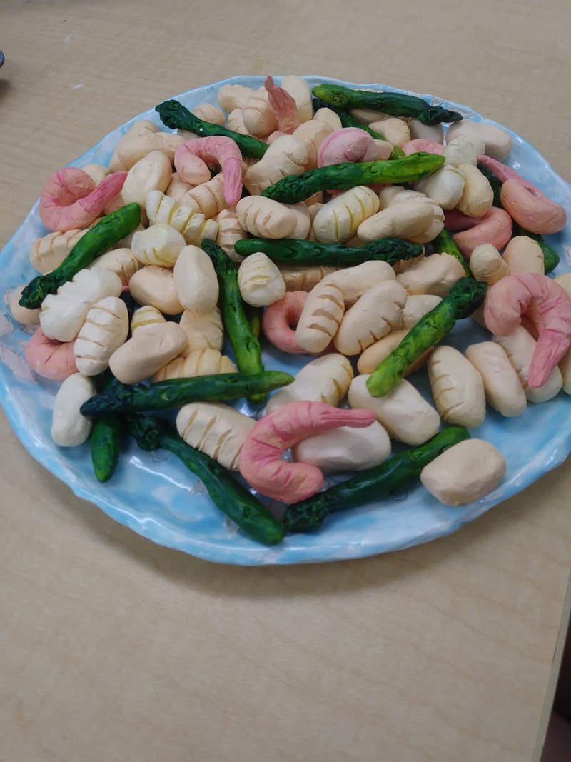
This is my final sculpture.
|
Critique Questions:
1) I think that my sculpture is relatively neat and well-executed. The food pieces are a lot more neat than the plate. The food pieces were small and easily able to smooth-out and sculpt. The plate, on the other hand, isn't as neat. I spent nearly an entire class period trying to make the edges smooth and even, and I eventually got to the point where I figured it was better to stop while I was ahead. The plate turned out more circular than I thought it would, the edges just weren't 100% even.
2) The most difficult part of the project was creating the plate. The pieces of food were relatively simple once I got the hang of them. It became just a matter of repeating the process until I had enough food. The plate, however, used a different technique and was supposed to be perfectly round. There was pressure to make the plate appear round and smooth like a real one. It also didn't turn out perfectly, but that's ok. I'll just have more experience next time.
3) i believe that the color choices worked together harmoniously. The color of the gnocchi, the asparagus, and the shrimp are all colored the way they are in real life, therefore the color palette worked as it does in real life. The plate also was a muted blue which didn't take away from the color of the food. My only problem with the color of the plate is that I didn't apply the glaze even enough and it came out splotchy. Other than that, the color turned out and worked together effectively.
4) My sculpture by itself is pretty simple, it's a plate with dumplings and other foods on it. It looks the same from all angles. I tried to layer the gnocchi, asparagus, and shrimp so that there weren't too many of one thing clumped in the same area. I also tried to bring in props that would enhance the design and make it look more like a dish at a real Italian restaurant.
5) When making a sculpture, you have to think about all parts of the object, not just the parts you want to present. In 2-D art, if you want to draw a sitting dog, you only have to worry about drawing the dog from the one perspective you choose. However, if you're sculpting it, you have to sculpt the perspective you want to emphasize, the back, the bottom, and all other sides and angles. You also have to think more about texture if you want to make the sculpture look realistic.
6) To create texture, I used my fingernail to carve grooves into the food. The gnocchi and shrimp were all just textured with my fingernail, however I used one of the scooping tools to make the dents in the asparagus. It was look-shaped on the end (like a bigger, thicker eye of a needle), so it was the perfect shape for creating the little grooves in the asparagus. To carve the designs in the plate, I used a sharp probe to do so. To try and make the plate smooth, I used a rib tool with water.
7) I think it looks like actual food. The textures, for the most part, match up with what the foods look like in real life. While sculpting the food, I took pictures of the food and then asked people I knew if they could identify it. Most of them could, even without color. The shrimp might be a little smaller than real shrimp, but they themselves have the textures of real shrimp. I feel like the gnocchi and asparagus are closer representations of real food though.
8) I would maybe make less of all the food pieces and focus more on the plate. I ended up having a lot of gnocchi and I didn't necessarily need all of them. For the plate, next time I could mold the clay to a real plate, so that the shape is more even and smooth.
Artist Painting Project
|
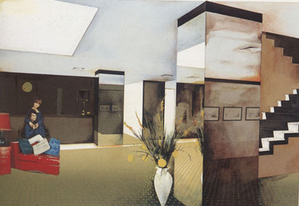
This is a painting called Lobby by my artist, Richard Hamilton. I really was drawn to this painting specifically because of the mirrors in the lobby and the two people that were glued into the painting.
|
|
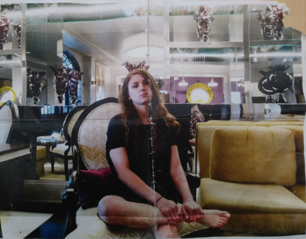
This is a photo I took of one of my friends in the lobby of a hotel/restaurant. I decided to make this photo my basis for my painting, because it makes use of mirrors and so did Richard Hamilton in many of his pieces.
|
|
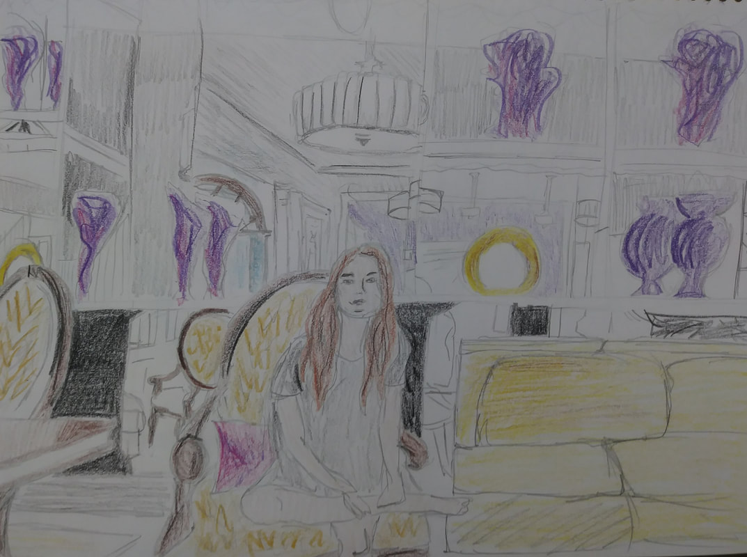
This is the initial rough sketch I did of the drawing. I knew from the beginning that I wasn't going to attempt to paint my friend, because not only is that a lot of pressure, but I also wanted to use Hamilton's technique of inserting people into the painting using magazine clippings.
|
|
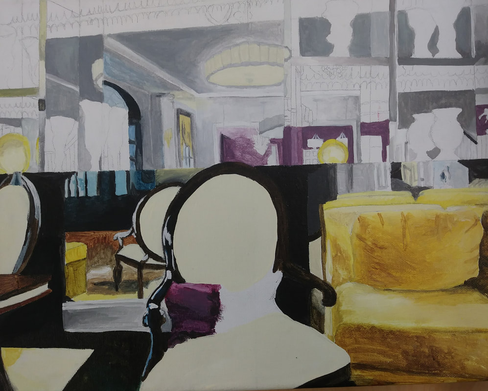
This was my painting after my first day of actually using paints. I had sketched it out the day before and started with the bottom half of the picture when painting.
|
|
After a few more days of painting, I started to get the hang of mixing my paints and getting the color values I wanted. I also was able to work more efficiently.
|
|
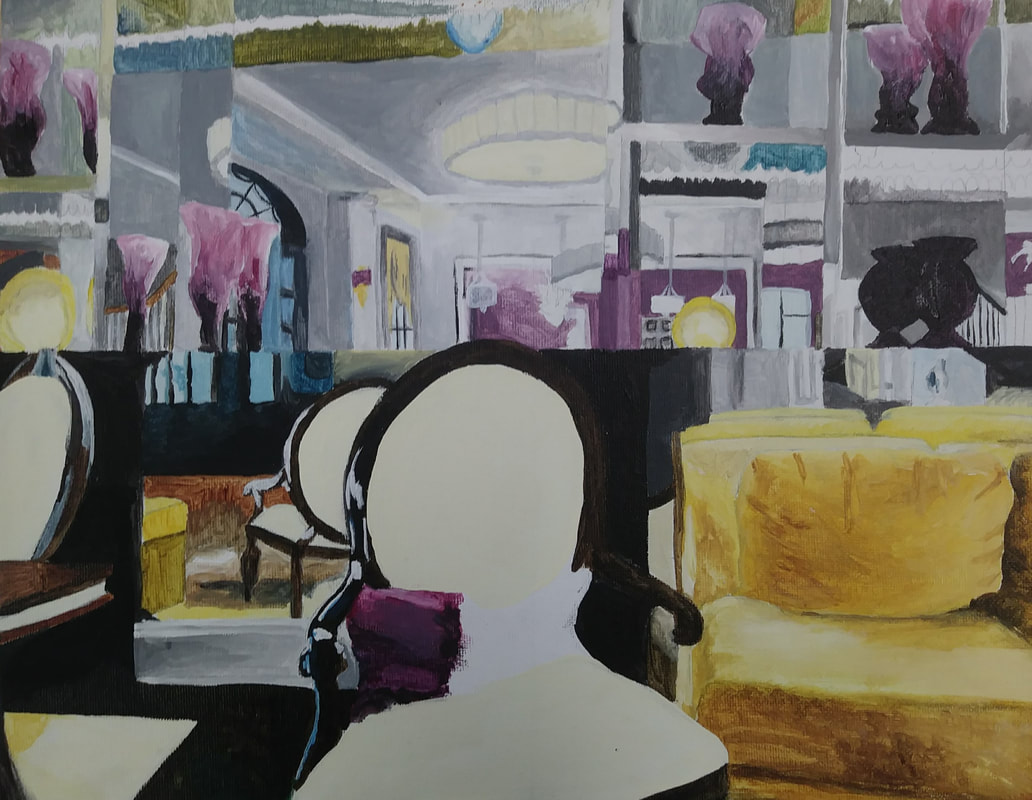
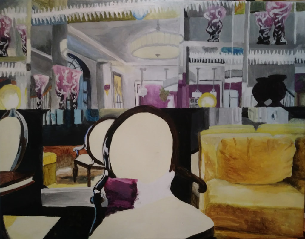
This is my final painting before adding in anything from the magazines. I still wasn't sure what to add in the chair and figured I would have my answer after looking through the magazine.
|
|
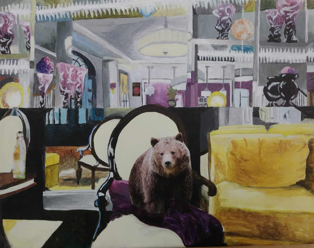
It turns out the answer was a bear. I added the bear and various nick-knacks in the background from the magazine. Because of the way the picture was in the magazine, the bear had no feet when I cut it out, so I added a blanket on the chair around its feet.
|
Reflection Questions:
1) My referenced artist was Richard Hamilton. Four main ideas I used in the painting was the use of mirrors, the use of magazine clippings to add to detail to the painting, the use of a more muted rather than vibrant, tropical color scheme, and placing something unexpected in a place where it commonly would not be found.
2) I feel as if the painting is neat and well-executed. I probably could have payed more attention to detail in the background, but seeing as the background isn't the main feature of the piece, I decided to spend less time on it. I also feel like I could have added a little bit more value changes in the background.
3) The most difficult part of this project was painting what I saw. I wanted to just skip some steps and paint the background how I wanted it to be, but I also wanted to stay true to the photo. I did stay true for the most part, however it was difficult to do because of all the detail in the background due to the mirrors. It was also difficult mixing the exact colors that I needed for the painting at any given time.
4) My color choices were more muted and less vibrant then some other pieces out there. Hamilton did this quite often in his pieces, as seen in his piece, Lobby, above. I also used a complimentary color scheme (violet and yellow) which was the color scheme used by the hotel lobby in which the photo was taken.
5) To recreate Hamilton's style, I focused on keeping the lines in the background neat and orderly. This is how many of his interiors are portrayed, as neat and orderly outlines with many things happening within. This was my goal while creating my piece. I wanted to to have a lot of things going on within it, but I also wanted it to be tidy, so that it was possible to see what was happening. I feel like it's not super obvious that the background is a mirror, but I also think that it's possible to get that vibe from it. It might just depend on the perspective of the person viewing it.
6) He would probably laugh (not in a mean way) and ask why I chose to put a bear in a hotel lobby. It's a question I don't even know the answer to myself. I also think that he would find it interesting and might try to analyse it from the perspective of the pop art movement. He might comment on the lavishness of the lobby and remark that it could represent the overwhelming presence of consumerism in our society.
7) If I could do this project again, I would pace myself differently so I could have more time to perfect the background and tidiness of it all. I also might try to get a palette with a lid that can seal, so that way, I wouldn't have to mix the same paints each day.
